


Business signs are, without a doubt, one of the most important aspects of any business’s visual curb appeal, but sometimes, good, creative business sign ideas can be few and far between.
In this tech-centric, high-paced world, we’re often talking about advertising and marketing online through social media and over mobile.
But when it comes to really grabbing people’s attention – whether it’s for your business or an event – sometimes a good, old-fashioned sign can be your best bet. More than half of small-business owners find in-store signage and graphics effective in attracting customers, according to the results of a nationwide survey commissioned by FedEx Office.
The survey - which polled more than 500 small businesses - also showed that 64 percent of millennial small-business owners (age 18 to 34) place value on creativity in graphics and signage. By contrast, their baby boomer counterparts (age 55 and older) place higher emphasis on simplistic designs.
Whatever your preferences, the way a sign is designed can have a significant influence on a company’s ability to acquire new customers.
Best Buy discovered that about 17 percent of its customers were people who did not intend to stop there but did so specifically because they saw the sign, which is well linked to their brand and overall marketing. Who hasn't been driving down the street, stopped at a store and purchased something, merely because they saw the sign?
How To Design A Business Sign
Do you really understand why some custom signs get your attention while others remain almost invisible? How much business will you continue to lose if your signage fails to get noticed or spark consumer interest? Not knowing these simple, yet profoundly important principles may very well be costing you more ongoing business than you realize.
You are about to discover the secrets of "How to Design a Sign". And then how you can use this knowledge to dramatically enhance the effectiveness of all your new custom signs, banners, vehicle graphics and more!
Where Do You Begin?
Ironically, one of the critical steps to how to design a sign has little to do with the design itself! Perhaps that's why it's overlooked by so many people. A great design starts with the right plan. And with the help of this guide, you'll quickly glide through the process in a matter of minutes with a greater sense of clarity and purpose than ever before.
So let's get you started out on the right foot with the core secret of how to design a sign!
In order to design a successful sign, you need to ask yourself a series of questions so that you know the exact type of sign that you need.
What Is The Purpose Of Your Sign?
Simple question, eh? But when you think about the answer, your focus will be razor sharp. And with a focused objective in mind, your message will be even more effective. There could be a variety of answers to this question, depending upon what you want your sign to do.
While a private business may need new signs with the specific purpose in mind of attracting new customers, a school may want a bright, colorful banner for their soccer team.
Needs and goals vary widely.
These key questions will help you focus on your own goals and objectives:
- What are your business goals?
- Who is your target audience?
- Is your message aimed at potential customers, existing clients, employees, visitors, students, members, residents, patients, guests, suppliers, investors, shoppers or passing motorists?
Now that you have these basic questions addressed, we can move on to step number one.
Step 1: What Will Your Sign Say?
Words are one of the most important design elements in signage.
The curvy shapes and lines of each letter create word forms which utilize valuable space in the design. And yet, we don't typically think of words as being a "design element" at all.
As a consequence, one of the most common design mistakes in creating a sign we see is bad wording. There's often a hodgepodge of ideas randomly tossed together in an attempt to create an effective marketing message. Could this be due to overlooking Step #1?
When you carefully choose the words which correspond with your sign's primary purpose, your message will be clear and precise.
Here Are Three Important Concepts To Help You Stay On The Right Track:
You Only Have 3½ Seconds! Seriously!
Signs viewed by passing motorists often have a lifespan of just 3½ seconds before the vehicle whizzes right on by. Overcrowding your sign with too many words or lines of text can make your message too difficult to read. Plus, too much information can make the sign look so busy, people won't take the time to read it. It's just too much effort!
Less Is More
The most successful sign design will communicate clearly and concisely. Therefore, in as few words as possible(seven or less), create the message you wish to convey to your target audience.
The number of words used on a sign is a classic example of where "Less Really Is More". This all seems so obvious, doesn't it? And yet I'm bringing this issue to your full attention — "just in case" — because overcrowding signs with too many words is still such a common problem.
Don't Leave Anything To Chance
You want people to know what type of business you are, otherwise they may not think that you’re worth visiting. Don’t put yourself in a situation where someone is looking for a business providing services like yours and your sign just says your name.
Step 2: How Should Your Message Be Designed?
All typefaces give the reader a certain feeling.
Your audience may not consciously notice the typeface. But they will be subconsciously influenced by the style, delivery, and personality of your message. If you think of typefaces as a theme representing you and/or your business, then you're on the right track.
Even BLOCK LETTERS come in hundreds of shapes and styles to fit any occasion.
Typefaces (also known as fonts) can be broadly characterized in two categories:
Friendly, warm and casual
Or formal, serious and traditional.
Some fonts can manage to be both formal and casual, depending on how they are used. And there are degrees of both formality and informality.
Step 4: Color Combinations
The use of color is vital to the effectiveness of a sign.
So how exactly do you use color effectively? The key is contrast. So what exactly is contrast?
Contrast is the difference in brightness between the light and dark areas present in a single design.
A bright yellow background, for example, will contrast well with dark letters such as black, a dark shade of blue or even purple. The greater the contrast or difference between the light and the dark colors, the more legible text is from a distance.
Colors that are closer together such as a medium gray letter against a black background won't contrast as well and therefore will be more difficult to read.
The use of a light colored letter against a dark background makes it seem larger. Light letters tend to come at you, whereas dark colors tend to recede.
Generally speaking, white as a background color is by far the most versatile because more colors naturally contrast better against a neutral white background than any other single color.
When you choose a background color for a custom sign other than white, you limit your choices for colors that will both stand out and "go with" that background color. That's not a good thing or a bad thing - it's just something to keep in mind when making color selections.
Step 5: Make Your Sign Interesting
You can make your sign interesting using design principles. Contrast is one of the easiest design principles to grasp. After all, it's easy to see how two objects are different.
Just be careful: you don't want everything in your design to contrast (stand out). Viewers won't be able to decide what's important if everything is contrasting. And that can distract from a message.
Essentially, contrast creates visual interest by placing two different objects next to one another. How can you create more visual interest? There are a lot of ways by varying;
Size
Fonts
Emphasis
Color
Value
Shape
Utilizing all of these key elements will be very important in making your sign stand out to potential customers.
Step 6: Text Size
How big should your letters be?
When it comes to choosing sizes, most people seem a bit lost. I can see it in their faces. They just don't know how to go about it mathematically. So they take their best guess and hope the sign will turn out okay.
However, HOPE IS NOT A STRATEGY!
Here's a strategy you can use right now to properly size your new signage
Think backward! That's right. If you want to size your new signage properly, it should be "reverse engineered". Don't worry, it's easy to do, once you learn this simple secret.
The secret is to size your letters first BEFORE you size your sign
After all, people don't read signs. They read the words displayed on signs. But only if the words are easy enough to read at a glance. If the letters are too small or too difficult to read, most people just won't bother.
So focus on choosing the size of your lettering, first. And then fit the sign to the size of the letters.
Which factors determine how big the letters should be?
There are two primary factors that determine what size the letters should be. Of course, there are important secondary factors to consider too. And you'll have the opportunity to learn about those in our advanced guide.
But to keep things simple and on point, here are the two primary factors:
Distance
And speed (for signs to be viewed by passing motorists).
First, you need to know the viewing distance.
The viewing distance equals how far away you want your sign to be readable. Yes, I know it may take you a few minutes to determine the distance. But guessing is outright gambling. And there's no point in taking an unnecessary risk here. There are a wide variety of calculators online that can help you determine the ideal size of your sign’s letters.
Step 7: Sign Placement
Almost as important as great design is great sign placement. It's easy to get caught up in designing a beautiful outdoor advertisement, only to discover your soft blue blends in with the sky behind it, leaving your message misunderstood and often times, completely unseen.
When creating your sign design, you must consider not only the internal design elements we have discussed in this book, but you must also consider external factors(the environment your sign will be placed in) as well. External factors can include things such as the color of the wall your sign will be mounted to and the color of all other surroundings.
Obviously, colors play a key role in sign design. It is important to be aware that you may need to consider altering or softening your business's existing color scheme if it happens to be inappropriate, too harsh or too soft for its environment. Take the image to the right, for example.
While the sign itself is well designed and has beautiful contrast on its own, the sign nearly disappears when mounted on this light colored brick wall. And while using earth tones in the design of a sign for a Bed & Breakfast in the mountains makes sense, in theory, such a sign may easily be camouflaged when displayed along the tree-lined, early path that leads your customers to your establishment.
Here Are Some More Quick Tips To Help You Make An Effective Sign:
Borders
Adding a border increases reading speed by 26%. Borders are often recommended whenever automobile traffic is the intended audience. A border regulates the reading space and brings focus directly to the center of the sign.
How To Turn Negative Space Into A Positive Design Element
"White space," also known as "negative space," simply refers to the empty area of a design that is devoid of any text or graphics. The empty spaces surrounding text and graphics are just as important as other design considerations. There is a tendency to "fill up" the available area with as much as possible. Text needs room to breathe. When text is crowded, the message becomes too difficult to read.
Design Principles
To get the most out of your signage, there are three important design principles all business owners need to keep in mind when designing banners, posters and other business signage.
1. Size
Simply put, the larger the letter, the easier it is to read. This is especially important if you’re creating roadside signage or signs that will be displayed at a significant distance -- at a conference, for instance.
A good rule of thumb might be 10 feet per inch of letter height. So lettering with 10 inches of height may have the best impact at 100 feet distance.
Different typefaces also affect legibility. While you may want a flowery script to convey a certain style, it may be difficult for people to read it over greater viewing distances.
2. Color
The choice of color plays a huge part in a well-designed sign. Think of “Coke red” or “McDonald’s yellow.” Often, color can help convey a brand’s identity.
Studies have shown that 80 percent of the recognition of a trademark is due to its color.
Another important consideration: trendy colors. Some business owners may feel compelled to convey their personality via signs that use current, modern colors. But care should be taken to consider longevity when designing static signage. Today’s color of the year could be tomorrow’s eyesore.
Be careful when considering if you want to do neon signs, use pastels, bold colors, or just stick with neutral colors. Think of what you’ll be conveying and choose what matches your business best.
3. Contrast
A sign’s contrast will usually determine its readability. Contrast, therefore, is a huge factor for any engaging sign.
Most business signage will include either text or graphics in the foreground, with a continuous background color. The contrast between these two items is critical to the viewer’s retention of the content.
For example, you might consider a dark color on a very light background, or the opposite of that -- black on white or white on blue. Pairing similar colors can decrease a sign’s readability.
However, a weak color contrast can be strengthened with an outline or drop shadow around the foreground lettering. Adding a border around the text or graphic also increases reading speed.
Find The Optical Center
Our final ingredient to highly effective business signs is understanding the concept of the "Optical Center." The optical center is the spot where the human eye tends to enter a page or design. Normally, our vision gravitates toward an area on the page slightly above the mathematical center. While the mathematical center is, of course, 50% down from the top of a page or design, the optical center falls around 46% down from the top of the page.
This theory can be applied to your signage two different ways.
The first is in the design of your sign. If you mathematically center text or a logo in your sign design, you'll notice that your information will seem a bit low. This can easily be corrected by nudging the design slightly higher within the boundaries of the layout.
Design Your Sign
We hope this adventure through these secrets of effective sign design has been educational and enjoyable for you! You are now armed with the essentials to making the best choices, allowing you to get the right sign for your needs. Now get designing!
INDOOR SIGNS
Reception Signs
A reception sign is usually one of the first impressions your business makes when new clients enter your office space. Reception signage firstly assures your customers that they have come to the right place. Secondly, your reception area transmits a visual message about your business.
Paint Finish (Gloss/Matte)
We offer our signs with paint finishes. It’s up to you as to whether you would rather have a glossy look or a flatter finish with the matte option. Because matte paints reflect less light, they visually smooth out variations and imperfections on the underlying surface. Glossy finishes highlight texture, but may have more glare.
Acrylic/Glass Finish
A type of finish similar to the lacquer, acrylic is a non-toxic, reflective high gloss finish which can give your signage a smooth appearance.
Steel Finish
Our steel finish is corrosion resistant and is great for adding an industrial aesthetic to your business.
Chrome Finish
Chrome is typically polished and very shiny, although the satin and brushed varieties can be more matte. It’s used in both decorative and industrial purposes because it is corrosion-resistant and has a high level of lustre.
Wayfinding/Direction Signs
Wayfinding signs are signs that tell you which way to go or confirms that you are on the right path or have arrived somewhere. Some examples are directional signs that point which way to go to reach a specific destination, or signs that read something like “Terminal 3B – 2-minute walk.”
Wayfinding signs can be created for interior or exterior use.
Utility Signs
Utility signs call attention to buried or overhead lines and cables, such as pipes, irrigation lines, gas lines, and power lines. They alert workers to be cautious before digging or when working near overhead lines to help prevent injuries, leaks, and damage.
Although these are typically for outside use, there are applications, such as in boiler rooms, commercial kitchens or manufacturing facilities, where utility signage is used for interior spaces.
Safety Signs
Our safety signs are a medium of communication that convey information or instructions regarding the physical safety of people. Signs in workplaces may be posted in a variety of areas in order to draw attention to them, such as on walls, on doors, on machinery and products, or as floor markings.
OUTDOOR SIGNS
Storefront Signs
A storefront sign is a critical part of any business with a physical location. It helps guide your customers to your establishment and sets the tone for business from the outside.
Front-lit Vinyl Signs
Have you seen signs in front of stores or apartments saying “NOW HIRING” or “LEASING NOW”? These signs are your basic form of Front-lit Vinyl. Front-lit means that you are using lighting on the front of the banner, and they’re made of a flexible vinyl material that reduces the glare. Another example would be most model banners in clothing department stores.
Back-lit Cabinet Signs
Backlit flex banner material is used when you have lights pointing in the back of the banner. They can be used outdoor and indoor with ease as they are weather-resistant and waterproof. More clear and visible image with back-light due to lower translucency.
Dibond Signs
If you want an excellent example of printing on Dibond, look no further than your traffic signs! It’s usually the choice when strength is an issue. Dibond signs are stable to temperature changes, flat, and also resistant to impact. In addition to traffic signs, they’re used as directional signage, for information, as wall signs, and shop fascia signs.
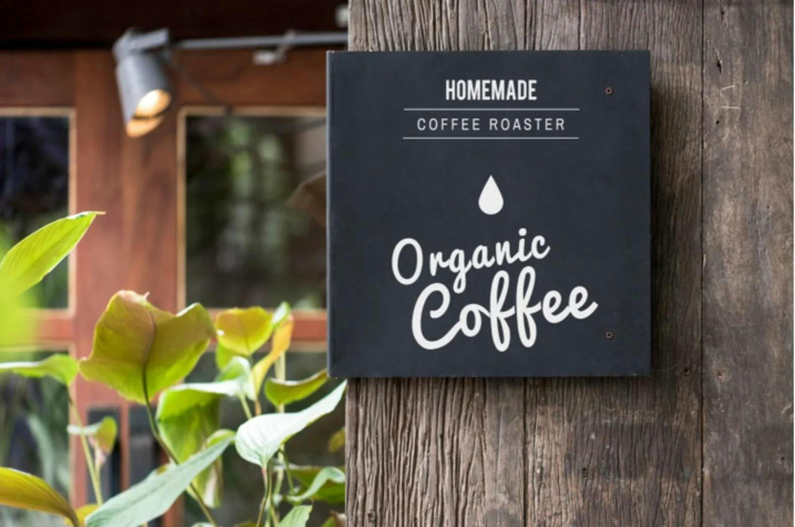
Wooden Finish Sign
These signs are great for adding a rustic aesthetic to your business or even as a simple decoration!
Channel Cut Letter Sign
A channel letter is a custom-made 3-dimensional letter sign fabricated from a sheet metal, typically aluminum, or plastic. The sheet of metal is cut by a computerized router or laser into the letter shapes needed to form the back of the channel letters.
Push-Thru 3D Acrylic Sign
Push thru signs are a special type of sign where the letter, logo, or shape is routed out of a solid surface and thick acrylic is routed to match. The acrylic has a hat on it and is “pushed through” the back of the sign and attaches to the solid surface.
Flag Hanging Signs and Banners
Outdoor banners and flags are ideal displays for outdoor sporting events and arenas, concerts, festivals, or to draw attention to any storefront. They’re great for drawing attention and are generally very portable, good for multiple uses at different locations.
Timing Signs
Timing signs are great for events like conventions where a schedule is needed to track activities and locations. They’re versatile and good for either indoor or outdoor use.
Directory Signs
Directory signs are also great for events, but they’re also ideal for places like hospitals, malls, or office buildings, where they can point a customer or employee to their desired location.