


Wall decals are the perfect repositionable decoration that is great for logos, displaying images, and creating areas of color on walls. Wall decals are versatile in design, coming in various shapes and sizes (including full-wall sized graphics), making design options limitless.
Wall decals are made from a flexible vinyl material, which your design is printed on. Unlike vinyl lettering, wall decals can be printed in a limitless amount of colors and designs, offering endless options for displaying.
Endless options mean that gradients and text effects are available with wall decals. We can also cut your design either to a generic rectangle shape (standard cut), along the edge of your design, leaving a slight border around it (halo cut), or cut exactly to the shape of your design (contour cut).
Because your design will be printed on a single sheet of opaque material, individual letters cannot be cut out. If you do include lettering in your design, they will be displayed with the background color on one continuous piece of material. It’s important to note that wall decals cannot be clear or transparent as the material by default is white.
Wall decals are also known as wall stickers or wall tattoos. The type we know of today has evolved from three generations.
The earliest generation of wall decals was made of PVC and came in only one color, although they may differ in size and shape. The next generation that followed produced wall decals that came in different colors but always with white edges. Unfortunately, there was no option to customize their sizes.
The modern type of wall decals which we recognize today came from the third generation which introduced wall decals with added features such as transparent borders and the option to reuse or remove them.
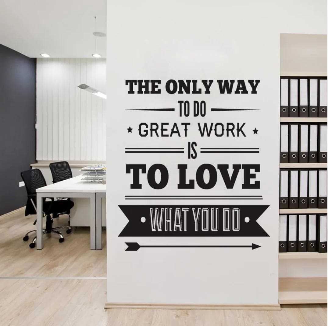
Logo wall decals are some of the best wall décor ideas because they can help you to establish your brand. However, there are plenty of types of decals that you can use, including illustrations for adding a bit of flavor and personality to your business space!
Wall Decals And Custom Vinyl
Printed Decals Are Made By Printing The Design Or Illustration Directly Onto Blank Vinyl. They Are Then Contour Cut Around The Design And Masked For Application. They Can Also Be Halo Cut, Where There Would Be A Blank White Space Around The Design Or Standard Cut Into A Square Or Rectangle Shape.
Vinyl Lettering Is Individually Cut From A Sheet Of Colored Vinyl Material, Which Has A Highly Adhesive Backing. Unlike Most Signs And Decals, The Color Of Vinyl Lettering Is Not Printed Onto The Material.
Instead, rolls of the material are manufactured in different shades of solid colors.
Due to these solid colored materials, the letters are limited to a single color without any gradients or multiple colors on a single letter. The individual lettering allows for customizable placement of letters on a wall.
Designing Your Decal
There are a wide variety of things to consider when designing and deciding your decals for your business. What are you trying to accomplish? Is it going to be used as artistic decoration? Are you trying to send a message to customers or employees? When you are designing your wall decal, consider the seven principles of design:
1. Emphasis
What’s the most important piece of information that you’re trying to share with this decal? Is it a specific image? Is it your business name? Is it your business hours or services? What’s the order of importance? Make a mental outline. Let your brain organize the information and then lay out your design in a way that communicates that order.
2. Contrast
Contrast is what people mean when they say a design “pops.” It comes away from the page and sticks in your memory. Contrast creates space and difference between elements in your design. Your background needs to be significantly different from the color of your elements so they work harmoniously together and are readable.
If you plan to work with type, understanding contrast is incredibly essential because it means the weight and size of your type are balanced. How will your audience know what is most important if everything is in bold?
As you seek out examples of really strong, effective design, you’ll notice most designs only feature one or two typefaces. That’s because contrast can be effectively achieved with two strong fonts (or even one strong typeface in different weights). As you add fonts, you dilute and confuse the purpose of your design.
3. Balance And Alignment
Never forget that every element you place on a page has a weight. The weight can come from color, size, or texture. Just like you wouldn’t put all your furniture in one corner of a room, you can’t crowd all your heavy elements in one area of your composition. Without balance, your audience will feel as if their eye is sliding off the page.
Symmetrical design creates balance through equally weighted elements aligned on either side of a centerline. On the other hand, asymmetrical design uses opposite weights (like contrasting one large element with several smaller elements) to create a composition that is not even, but still has equilibrium.
Symmetrical designs are always pleasing, if not occasionally boring. Asymmetrical designs are bolder and can bring real visual interest and movement (more on that later!) to your composition.
4. Repetition
If you limit yourself to two strong typefaces or three strong colors, you’ll soon find you’ll have to repeat some things. That’s ok! It’s often said that repetition unifies and strengthens a design. If only one thing on your band poster is in blue italic sans-serif, it can read like an error. If three things are in blue italic sans-serif, you’ve created a motif and are back in control of your design.
Repetition can be important beyond one printed product. Current packaging design is heavily embracing beautiful illustrated patterns. Anyone thinking about a startup knows one of the first things you need is a strong logo to feature on your website, business cards, social media and more. Brand identity? Another term for repetition. This can be achieved through your wall decals, but also remember that there’s a fine line between establishing brand identity and overwhelming your audience.
5. Movement
Movement is controlling the elements in a composition so that the eye is led to move from one to the next and the information is properly communicated to your audience. Movement creates the story or the narrative of your work.
If you look at your design and feel your eye get “stuck” anywhere on it—an element is too big, too bold, slightly off-center or not a complimenting color—go back and adjust until everything is in harmony.
6. Proportion
Proportion is the visual size and weight of elements in a composition and how they relate to each other. It often helps to approach your design in sections, instead of as a whole.
Grouping related items can give them importance at a smaller size—think of a box at the bottom of your poster for ticket information or a side search bar on a website.
Proportion can be achieved only if all elements of your design are well-sized and thoughtfully placed. Once you master alignment, balance, and contrast, proportion should emerge organically.
7. White Space
All of the other elements deal with what you add to your design. White space (or negative space) is the only one that specifically deals with what you don’t add. White space is exactly that—the empty page around the elements in your composition. For beginning designers, it can be a perilous zone. Often simply giving a composition more room to breathe can upgrade it from mediocre to successful.
White space isn’t sitting there doing nothing—it’s creating hierarchy and organization. Our brains naturally associate ample white space around an element with importance and luxury. It’s telling our eyes that objects in one region are grouped separately from objects elsewhere.
Even more exciting, it can communicate an entirely different image or idea from your main design that will reward your audience for engaging with it.
We know that the seven principles of design can be overwhelming, but all play a part in how your wall stickers’ composition will turn out. Whether your vinyl wall decals are using your logo, showing artwork, or you’re trying to share other information such as an event or a seasonal sale, the design is the most important part of how effective your wall stickers will be at sharing your message.
Installation
Wall Decal application is very easy and adhering a wall decal takes no time at all! All you need to do is position it on a wall (a smooth, non-porous surface) and peel away the backing while applying pressure to the decal. Once applied to the wall, it will stay secure and last for 5+ years. The low-tac adhesive allows for easy removal and limitless repositioning of the decal.
We recommend only applying the decal indoors and in areas where there is not a high amount of humidity. Increased contact with moisture can affect the quality of the adhesive.
What About Removal?
Wall decal removal is quite simple. Most wall decals are made using removable adhesive, so to prevent damaging your wall someday when the decal is removed. Start in the corner of your wall decal and pull slowly at a steep angle. Wall may require touch-up paint or repair, depending on the age of the decal and finish of the wall.
Try Out Wall Decals!
Much like vinyl lettering, wall decals are truly a multi-purpose sign and can be used for a wide variety of uses in both personal and business settings. You can use them to attract customers, share information with customers and employees, establish your brand identity, show some style, and make your business look better!
Do you have any questions or want to discuss a wall decal for your workspace? Contact Branditt for your latest wall decal concerns and needs!